
 I took the first design and made the toilet sign men larger changed the five men to one running man matching the album name "Run and Hide". Using the same effect as the one before I added a glow this has darkened edges and to give the titles a highlight I used an outer glow on the crown.
 Wednesday, 9 December 2009

I have used the heart and crown from the "I LOVE TG". I felt this was a really good aspect of that design as it really stood out. ON this design I have used a effect giving the heart a glow around it. It then fades to black. I made the white writing slightly transparent. I did this to keep the main focus on the heart. I also add some reviews at the the bottom of the page. After looking at a few album advertisement I found this to be one of the conventions.

This design was inspired by the "I LOVE NY" brand. I chose to use this ideas as previously the Goodness have used a well know brand such as Stella Artois. The changed the the name and replaced it with "The Goodness". This is a really good way to use advertise the band as people recognise the brand and then are surprised that it is an advertisement for something else. I added a deep shadow to highlight the font and heart and crown. I chose to use TG as it is "The Goodness". As people will not know what it is they will be intrested to find out what it is. 


Thursday, 3 December 2009
 This was my first idea for a poster. I chose to use the toilet door sign repeated I did this to represent the number of mass bands that a produced over and over again. Then using `The Goodness` crown I place it over five of the toilet door men. To make the crowned men stand out more I made the other men more transparent. The connotations of this it that `The Goodness`stand out from the rest of the other bands.
 Thursday, 5 November 2009
Roles of each member of the Group
We have divide up each of the roles between each of us.
Director:JOSH
Camera:JOSH
Props and Costumes:KENNY
Lighting: JOSH&KENNY
Blog dairy:JOSH&KENNY
CD cover: KENNY
Posters: JOSH
Editing: JOSH
Music: KENNY
Director:JOSH
Camera:JOSH
Props and Costumes:KENNY
Lighting: JOSH&KENNY
Blog dairy:JOSH&KENNY
CD cover: KENNY
Posters: JOSH
Editing: JOSH
Music: KENNY
Story Board Video
Using the Programme Photo Story 3. This programme is a photo montage programme where images are upload then can be ordered, time can be set to for how long the shot can be shown and then music can be applyed.
I really enjoyed creating this storyboard as it allows our intended audience to see what the video may eventually look like.
Wednesday, 14 October 2009
Storyboards

For the narrative shots we went out with a stills camera and took a few of the shots we will be using for our video. We did not use the location we will actual be using as it is currently undecided as there may be differences mise en scene.
Tuesday, 6 October 2009
Shot Types Research
We looked at a range of different videos in our genre. We then took screenshots of them to use these as example shots and the shots that we could use. We choose these perciular shots as these are the most interesting. The examples of these screenshots are on kennys blog.
media-a2-music-video.blogspot.com
media-a2-music-video.blogspot.com
Plan of Action
What we have to do next?
- Story boards
- Test of the camera in the dark i.e the street lighting
- Plan:Who?What?When?How?
Thursday, 1 October 2009
Interviews
We conducted an interview with people that are in our target audience. We found this useful as it gave us more of an insight into our planning for our music video and CD cover.
Wednesday, 23 September 2009
Locations
For the performance shots we will be using the Old Duke Pub practice room. This has been perviously used on the Video 'My Girl Friends an Arsonist' for the band Yes Rebels perviously known as Fortune Drive. We have choosen to use this as it is repersents a recording studio.The narrative is going to be filmed in urban areas around Bristol.These fit the codes and convention of the genre because many of them are filmed in urban environments.
Tuesday, 14 July 2009

Monday, 29 June 2009
 Analysis
This is the Album cover "a modern question" for the band Fortune Drive (Now known as Yes Rebels). The background colours used are bright and a eye catching. Contrasting to that the image of the girl is black and white this image is of a small under aged child holding a bottle of lager with a parental Advisory over the label. This image of the girl is as if it has been up sparyed on the cover indcations of this is the black and white at the bottom draining off. The colour of the lager bottle matches with the background as it is not the same colour as the background so it does not completely blend with the background. This style is edgy which matches with the bands style.

This is the "Run and Hide" EP (Extended Play) an already exsisting EP realised by The Goodness. the image on the right is the front. The main image is of a stair case with "The Goodness" name and logo above. The image is of a set of stairs, it has a slight tint of orange from the lights. The stairs could mean that they are on their way up the music industries stairs of success. There are no memebers of the band feactured on the cover this is code of the genre. The name of the EP is featured in the corner on the front. It is relatively small compaired to the name of the band. The image used for the back cover is of an underground walkway so it is very dark and it has a single figure walk away from the camera. Above the image are the names of the songs this one of the codes and conventions as the names of the songs are located on the back of the CD case. Also on the back below the image is all the recording information and copyrights.
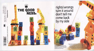 This is another EP from The Goodness called "The Shape of Things to Come". Compaired to the other EP it is alot lighter image in lighting and in humour. On the left hand side is the front of the EP. The image is of two cranes building the title of the EP. The image and the name of the EP match together becuase it is like the shape of the things to come is like they are saying we are on are way up. Again on the front it has the name and logo. On the back of the EP(right) it has continued with the theme of building as it has used the crane again. This is like the crane is representing the band and is pull aspects to build some thing good. The names of the songs are located on the back at the top. The copyright information is located at the bottom.
 This is another EP from The Goodness called "The Shape of Things to Come". Compaired to the other EP it is alot lighter image in lighting and in humour. On the left hand side is the front of the EP. The image is of two cranes building the title of the EP. The image and the name of the EP match together becuase it is like the shape of the things to come is like they are saying we are on are way up. Again on the front it has the name and logo. On the back of the EP(right) it has continued with the theme of building as it has used the crane again. This is like the crane is representing the band and is pull aspects to build some thing good. The names of the songs are located on the back at the top. The copyright information is located at the bottom.
 Looking at these CD covers has helped me get some insight of what will be include on the cover:
- The name and logo
- copyright information on the back
- names of the songs
- barcode
- an image that does not have the band on it
- an orginal image
Tuesday, 23 June 2009
These links are to The Goodness Myspace and Facebook pages.
www.facebook.com/pages/The-Goodness/22078872216
www.myspace.com/thegoodnessmusic
www.facebook.com/pages/The-Goodness/22078872216
www.myspace.com/thegoodnessmusic
We have used the connection that Kenny has with The Goodness to get their permission to use one of there songs. The next part of the production is to choose a name and logo for the company. Then the next step is to look at similar artist to The Goodness and from that get the codes and convention of the genre. Then after that to discuss a few idea on songs and storylines behind the songs.
Monday, 22 June 2009
Time Plan
Time management:
- June dedicated to Research into: genre, audience, location
- June-July: Interviews, Shot type research
- September: Story Board Video, Deciding Roles of each member
- October: Poster ideas and designs, and final choices
- November-December: Filming
- January (2010): Editing
- February: Showings of video to target audience
- March: Final editing
Practical Production
Brief
Create a Promotion music video with other Promotion product:
Create a Promotion music video with other Promotion product:
- website homepage
- advertisement for CD cover
- CD cover
Subscribe to:
Comments (Atom)
